
Han Shot First: mixed signals during Covid
Taking a close look at how the BLS data performed in 2020

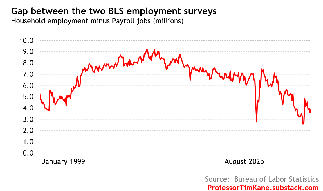
Taking a closer look at the mixed signals in the two U.S. employment numbers (payroll jobs P and total employment from the household survey H), I discovered that one of the charts I presented my last post had a tiny error. The main data chart showing P and H was fine, but the Gap chart used a smoothed H series (call it H*) that caused me confusion (thankfully, none of my readers noticed before I did, but I still regret the glitch. Apologies!). By looking at the data more carefully, and focusing on the COVID shock of spring 2020, I found out something interesting.
Rewinding history, the key dates for the emergence of COVID are:
January 20, 2020: The CDC confirmed the first laboratory-confirmed case of the virus in the United States in a patient in Washington state who had recently traveled to Wuhan.
February 26, 2020: The first US case of community transmission, with no known link to international travel, was confirmed in California.
February 29, 2020: The first official US death from COVID-19 was announced in Washington state. Later analysis found evidence of earlier deaths.
March 13, 2020: The US government declared COVID-19 a national emergency.
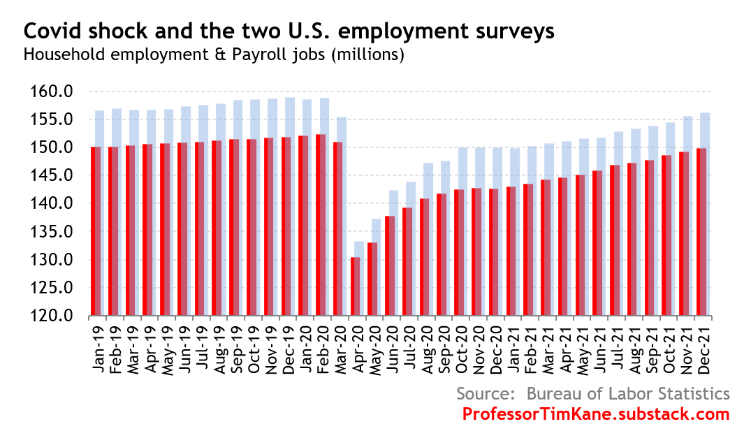
Take a close look at how the BLS series behaved in response to the COVID shock in the following chart. Both series are growing slowly in January and February, and both show a sharp drop in March followed by a historically unprecedented employment collapse in April. The bounce back was immediate, but slow. The U.S. labor market was still not fully recovered twenty months later.
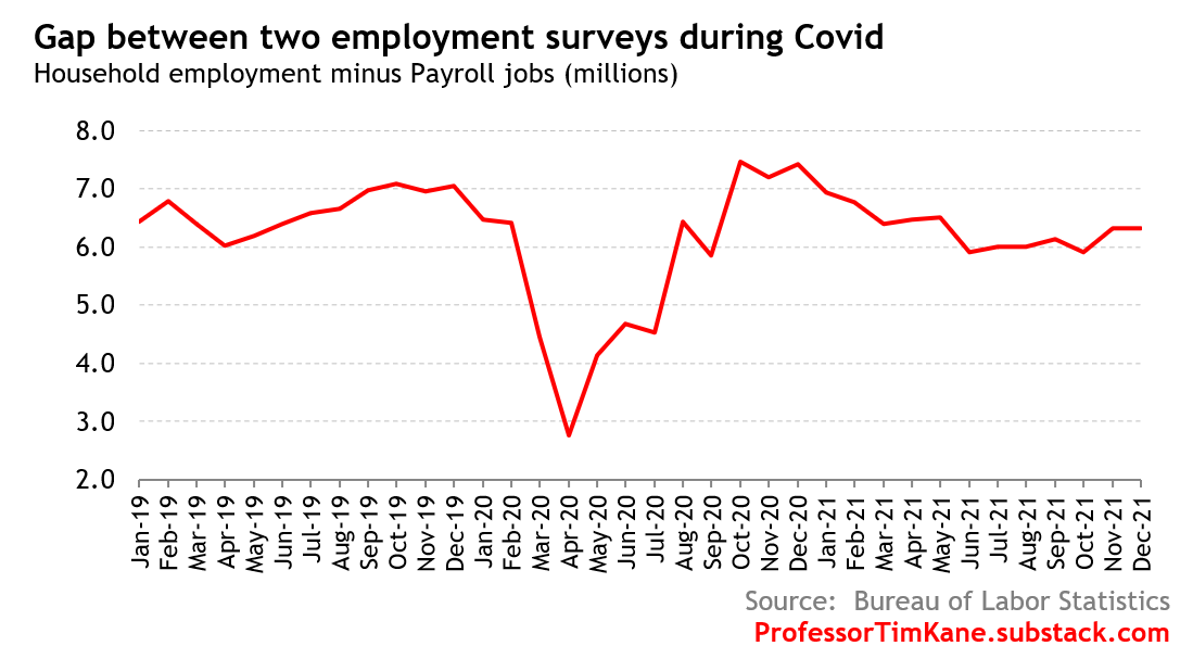
Next, take a look at a (corrected) chart that shows the difference in the two surveys. As I said, my first stab at this long series over the weekend used a smoothed H*, whereas this one is using the correct P and H series. Although, to be clear, the P series is not vintage as first reported since, as you know, the BLS regularly updates the series two times (once a month, respectively, for two months after the initial vintage report). Rather than quibble about the vintage numbers, I want to make this observation: Han shot first.
What I mean to say is that the H survey drops faster than P survey — this is reflected in the steep canyon spike down in April 2020 to 3m, and when the P series follows in severity, the right side of the gap canyon rebounds up to the 7m level. Let’s zoom in with the following chart.
This post is a reinforcement of my confidence in the Household survey as better than the Payroll survey during turning points.
You know what, let’s go ahead and look into the vintage series, so I can hammer this home. The revised data for total employment from the two series in February, March, and April of 2020 are today reported as:
Household Survey: 158.7m — 155.4m — 133.2m.
(That’s a 3.3 million drop, followed by a 22.2 million drop)Payroll Survey: 152.3m — 150.9m — 130.4m.
(a 1.4 million drop, followed by 20.5 million drop)
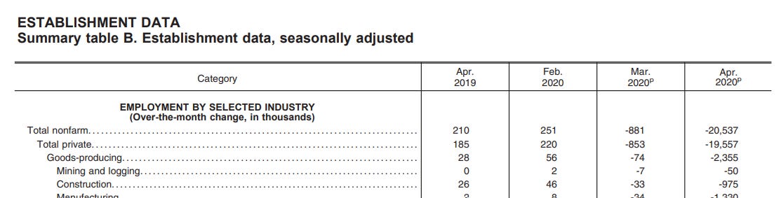
However, the original (i.e. vintage) Payroll Survey report issued for April 2020 on the first Friday of May, 2020 was different. It said that nonfarm payrolls were down by 20.5m that month, but only a revised 881,000 decline in March. In fact, the original March report was even milder. “Total nonfarm payroll employment fell sharply in March (-701,000).” Take a look at the screenshot of the April Report’s PDF:
Yet the Household survey numbers were screaming a collapse of 3 million in reported employment in March. When? Right away. In fact, the March 2020 BLS report said, “The number of unemployed persons rose by 1.4 million to 7.1 million in March.”
Han shoots first every time.